
此插件允许玩家直接在聊天中展示他们手中持有的物品!只需在消息中输入一个简单的占位符,你的物品就会显示出来供所有人查看。其他人可以悬停在上面以查看其名称、附魔以及所有细节,就像在背包中一样。
功能
- ✅ 展示主手、副手和盔甲
- ✅ 使用简单的命令或在聊天中使用占位符
- ✅ 通过聊天中的图标快速查看玩家展示了什么物品
- ✅ 当鼠标悬停在聊天中的物品名称上方时,查看物品的所有详细信息
- ✅ 完全可配置
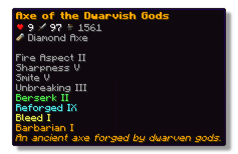
权限
- wyg.use - 允许使用 WYG 命令
- wyg.hand - 允许展示主手中的物品
- wyg.offhand - 允许展示副手中的物品
- wyg.helmet - 允许展示头盔
- wyg.chestplate - 允许展示胸甲
- wyg.leggings - 允许展示护腿
- wyg.boots - 允许展示靴子
- wyg.equipment.others - 允许展示其他玩家的装备
- wyg.reload - 允许重新加载 WYG 配置文件(默认:op)
配置
你可以在 plugins/WYG 文件夹中找到配置文件。主配置文件是 config.yml。
config.yml
# ═══════════════════════════════════════════════════════════════════════════════
#
# █████ ███ █████ █████ █████ █████████
# ▒▒███ ▒██ ▒▒███ ▒▒███ ▒▒███ ███▒▒▒▒▒███
# ▒███ ▒███ ▒███ ▒▒███ ███ ███ ▒▒▒
# ▒███ ▒███ ▒███ ▒▒█████ ▒███
# ▒▒███ █████ ███ ▒▒███ ▒███ █████
# ▒▒▒█████▒█████▒ ▒███ ▒▒███ ▒▒███
# ▒▒███ ▒▒███ █████ ▒▒█████████
# ▒▒▒ ▒▒▒ ▒▒▒▒▒ ▒▒▒▒▒▒▒▒▒
#
# ═══════════════════════════════════════════════════════════════════════════════
#
# WYG - What'd Ya Got!
# The first item display plugin featuring 1.21+ sprites
#
# • Advanced placeholders
# • Fully translatable
# • Advanced formatting with MiniMessage
#
# Documentation:
# • All Placeholders: https://docs.zetaplugins.com/wyg/config/config
# • Formatting: https://docs.advntr.dev/minimessage/format.html
# • Sprites: https://mcasset.cloud/1.21.10/assets/minecraft/textures
#
# ═══════════════════════════════════════════════════════════════════════════════
# ═══════════════════════════════════════════════════════════════════════════════
# Share Message Settings
# ═══════════════════════════════════════════════════════════════════════════════
# Configure the message displayed when running /wyg
#
# Relevant Placeholders:
# <player> - The player's name
# <player_head> - The player's head sprite
# <item> - The formatted item (uses item-display config below)
#
# Examples:
# "<player> shared <item>"
# "<player_head> <player> <gray>shared</gray> <item>"
# "<player_head> <gray>shared</gray> <item>"
# "<gradient:yellow:gold><player_head> <player></gradient> <gray>→</gray> <item>"
share-message:
format: "<player_head> <player> <gray>shared</gray> <item>"
# ═══════════════════════════════════════════════════════════════════════════════
# Item Display Settings
# ═══════════════════════════════════════════════════════════════════════════════
# Configure how items are displayed in chat
#
# Available Placeholders:
# <sprite> - The item sprite/icon
# <item> - The item name
#
# You can also use custom sprites here:
# <sprite:gui/hud/heart/full> - A heart icon
# <sprite:gui/icon/checkmark> - A checkmark icon
#
# Examples:
# "[<sprite> <item>]"
# "<aqua><u>[<sprite> <item>]</u></aqua>"
# "<sprite> <bold><item></bold>"
# "<gradient:green:blue><sprite> <item></gradient>"
# "<sprite:gui/hud/heart/full> <sprite> <item>"
item-display:
format: "<sprite> <item>"
# ═══════════════════════════════════════════════════════════════════════════════
# Hover Tooltip Configuration
# ═══════════════════════════════════════════════════════════════════════════════
# You are entering advanced territory! Everything here is already setup to
# replicate Minecraft's default tooltips!
hover-text:
enabled: true
─────────────────────────────────────────────────────────────────────────────
提示框布局
─────────────────────────────────────────────────────────────────────────────
定义提示框元素(tooltip)的顺序与格式
可用占位符:
<name> - 物品名称(单行)
<stack> - 堆叠数量(若为 1 则省略)
<enchantments> - 所有附魔(多行,若无则省略)
<lore> - 所有描述文本(多行,若无则省略)
<attributes> - 所有属性及对应的槽位标题(多行,若无则省略)
<durability> - 耐久度显示(若物品无耐久度则省略)
<item_name> - 基础材质名称(根据“渲染方式与名称相同时是否隐藏”设置决定是否省略)
自定义精灵图:
示例:
说明:
• 空行("")会在各部分之间创建间距
• 如果空行前后没有内容,它们会被自动跳过
• 任何占位符都可以包裹在 MiniMessage 格式中
示例:
"<gray><enchantments></gray>"
布局:
<名称>
<附魔>
<描述>
- ``
<属性>
- ``
<堆叠>
─────────────────────────────────────────────────────────────────────────────
物品名称配置
─────────────────────────────────────────────────────────────────────────────
配置基础物品名称(材质名称)的显示方式
可用占位符:
<item_name> - 材质的可翻译名称
注意:这与 <name> 不同,<name> 用于显示物品的自定义显示名称
render-if-same-as-name: 当 <item_name> 与 <name> 完全相同时(即物品未被重命名时),是否显示 <item_name>
物品名称:
格式:"<item_name>"
当与名称相同时不渲染:false
─────────────────────────────────────────────────────────────────────────────
附魔格式
─────────────────────────────────────────────────────────────────────────────
单行附魔文本的格式
可用占位符:
<enchantment> - 附魔名称(可翻译)
<level> - 附魔等级(可翻译)
你也可以在此处添加精灵图标:
enchantment-format: "<gray><enchantment><level></gray>"
─────────────────────────────────────────────────────────────────────────────
堆叠数量格式
─────────────────────────────────────────────────────────────────────────────
堆叠数量显示的格式
可用占位符:
<amount> - 堆叠数量
stack-format: "<gray>堆叠数量: <amount></gray>"
─────────────────────────────────────────────────────────────────────────────
耐久度格式
─────────────────────────────────────────────────────────────────────────────
耐久度显示的格式
可用占位符:
<current> - 当前耐久度 (最大值 - 伤害值)
<max> - 最大耐久度
durability-format: "<gray>耐久度: <current>/<max></gray>"
─────────────────────────────────────────────────────────────────────────────
属性显示设置
─────────────────────────────────────────────────────────────────────────────
配置物品属性在提示框中的显示方式
attributes:
# 槽位标题格式
# 槽位标题的格式(例如:“在主手时:”)
#
# 可用占位符:
# - 槽位名称
#
# 注意:设置为空字符串 ("") 可完全隐藏槽位标题
slot-header-format: "<gray><slot></gray>"
# 单个属性格式
# 配置每种属性类型的显示方式
#
# 可用占位符:
# <value> - 数值
# <attribute> - 属性名称
#
# 你可以为属性添加自定义精灵图标:
# "<sprite:gui/hud/heart/full> <dark_green> <value> <attribute></dark_green>"
#
# 注意:默认颜色与原版 Minecraft 一致
# • dark_green - 攻击类属性(伤害、攻击速度)
# • blue - 防御类属性(护甲、护甲韧性、击退抗性)
formats:
attack_damage: "<dark_green> <value> <attribute></dark_green>"
attack_speed: "<dark_green> <value> <attribute></dark_green>"
armor: "<blue>+<value> <attribute></blue>"
armor_toughness: "<blue>+<value> <attribute></blue>"
knockback_resistance: "<blue>+<value>% <attribute></blue>"
</details>
## 支持
如果你需要插件设置方面的帮助,或者发现了 bug,你可以加入我们的 Discord [这里](https://strassburger.org/discord)。
[](https://strassburger.org/discord)
---
[](https://bstats.org/plugin/bukkit/WYG/27519)

This plugin lets players show off whatever they’re holding right in chat! Just type a simple placeholder in your message, and your item pops up for everyone to see. Others can hover over it to check out its name, enchantments, and all the details just like in your inventory.
Features
- ✅ Show off main hand, off-hand and armor
- ✅ Use a simple command or placeholders in chat
- ✅ Quickly see what item a player is showing off with icons in the chat
- ✅ See all details of an item when hovering above the name in chat
- ✅ Fully configurable

Permissions
- wyg.use - Allows usage of WYG commands
- wyg.hand - Allows showing items in main hand
- wyg.offhand - Allows showing items in offhand
- wyg.helmet - Allows showing helmet
- wyg.chestplate - Allows showing chestplate
- wyg.leggings - Allows showing leggings
- wyg.boots - Allows showing boots
- wyg.equipment.others - Allows showing other players' equipment
- wyg.reload - Allows reloading the WYG configuration (default: op)
Configuration
You can find the configuration files in the plugins/WYG folder. The main configuration file is config.yml.
config.yml
# ═══════════════════════════════════════════════════════════════════════════════
#
# █████ ███ █████ █████ █████ █████████
# ▒▒███ ▒██ ▒▒███ ▒▒███ ▒▒███ ███▒▒▒▒▒███
# ▒███ ▒███ ▒███ ▒▒███ ███ ███ ▒▒▒
# ▒███ ▒███ ▒███ ▒▒█████ ▒███
# ▒▒███ █████ ███ ▒▒███ ▒███ █████
# ▒▒▒█████▒█████▒ ▒███ ▒▒███ ▒▒███
# ▒▒███ ▒▒███ █████ ▒▒█████████
# ▒▒▒ ▒▒▒ ▒▒▒▒▒ ▒▒▒▒▒▒▒▒▒
#
# ═══════════════════════════════════════════════════════════════════════════════
#
# WYG - What'd Ya Got!
# The first item display plugin featuring 1.21+ sprites
#
# • Advanced placeholders
# • Fully translatable
# • Advanced formatting with MiniMessage
#
# Documentation:
# • All Placeholders: https://docs.zetaplugins.com/wyg/config/config
# • Formatting: https://docs.advntr.dev/minimessage/format.html
# • Sprites: https://mcasset.cloud/1.21.10/assets/minecraft/textures
#
# ═══════════════════════════════════════════════════════════════════════════════
# ═══════════════════════════════════════════════════════════════════════════════
# Share Message Settings
# ═══════════════════════════════════════════════════════════════════════════════
# Configure the message displayed when running /wyg
#
# Relevant Placeholders:
# <player> - The player's name
# <player_head> - The player's head sprite
# <item> - The formatted item (uses item-display config below)
#
# Examples:
# "<player> shared <item>"
# "<player_head> <player> <gray>shared</gray> <item>"
# "<player_head> <gray>shared</gray> <item>"
# "<gradient:yellow:gold><player_head> <player></gradient> <gray>→</gray> <item>"
share-message:
format: "<player_head> <player> <gray>shared</gray> <item>"
# ═══════════════════════════════════════════════════════════════════════════════
# Item Display Settings
# ═══════════════════════════════════════════════════════════════════════════════
# Configure how items are displayed in chat
#
# Available Placeholders:
# <sprite> - The item sprite/icon
# <item> - The item name
#
# You can also use custom sprites here:
# <sprite:gui/hud/heart/full> - A heart icon
# <sprite:gui/icon/checkmark> - A checkmark icon
#
# Examples:
# "[<sprite> <item>]"
# "<aqua><u>[<sprite> <item>]</u></aqua>"
# "<sprite> <bold><item></bold>"
# "<gradient:green:blue><sprite> <item></gradient>"
# "<sprite:gui/hud/heart/full> <sprite> <item>"
item-display:
format: "<sprite> <item>"
# ═══════════════════════════════════════════════════════════════════════════════
# Hover Tooltip Configuration
# ═══════════════════════════════════════════════════════════════════════════════
# You are entering advanced territory! Everything here is already setup to
# replicate Minecraft's default tooltips!
hover-text:
enabled: true
# ─────────────────────────────────────────────────────────────────────────────
# Tooltip Layout
# ─────────────────────────────────────────────────────────────────────────────
# Define the order and formatting of tooltip elements
#
# Available Placeholders:
# <name> - Item name (single line)
# <stack> - Stack size (skipped if amount is 1)
# <enchantments> - All enchantments (multi-line, skipped if none)
# <lore> - All lore lines (multi-line, skipped if none)
# <attributes> - All attributes with slot headers (multi-line, skipped if none)
# <attributes:attack_damage> - Attack damage across all slots (skipped if none)
# <attributes:attack_speed> - Attack speed across all slots (skipped if none)
# <attributes:armor> - Armor across all slots (skipped if none)
# <attributes:armor_toughness> - Armor toughness across all slots (skipped if none)
# <attributes:knockback_resistance> - Knockback resistance across all slots (skipped if none)
# <durability> - Durability display (skipped if item has no durability)
# <item_name> - Base material name (skipped based on render-if-same-as-name setting)
#
# Custom Sprites:
# You can use <sprite:atlas/path> anywhere in the layout!
# Examples:
# "<sprite:gui/hud/heart/full> <name>"
# "<sprite:gui/icon/checkmark> <gray>Enchanted!</gray>"
#
# Notes:
# • Empty lines ("") create spacing between sections
# • Empty lines are automatically skipped if no content surrounds them
# • Any placeholder can be wrapped in MiniMessage formatting
#
# Examples:
# "<gray><enchantments></gray>"
# "<gradient:red:blue><name></gradient>"
# "<sprite:gui/hud/heart/full> <name>"
layout:
- "<name>"
- "<enchantments>"
- "<lore>"
- ""
- "<attributes>"
- ""
- "<stack>"
# ─────────────────────────────────────────────────────────────────────────────
# Item Name Configuration
# ─────────────────────────────────────────────────────────────────────────────
# Configure how the base item name (material name) is displayed
#
# Available Placeholders:
# <item_name> - The material's translatable name
#
# Note: This is different from <name> which shows the item's custom display name
#
# render-if-same-as-name: Whether to show <item_name> when it's identical to <name>
# (i.e., when the item hasn't been renamed)
item-name:
format: "<item_name>"
render-if-same-as-name: false
# ─────────────────────────────────────────────────────────────────────────────
# Enchantment Format
# ─────────────────────────────────────────────────────────────────────────────
# Format for individual enchantment lines
#
# Available Placeholders:
# <enchantment> - The enchantment name (translatable)
# <level> - The enchantment level (translatable)
#
# You can add sprite icons here too:
# "<sprite:gui/icon/checkmark> <gray><enchantment> <level></gray>"
enchantment-format: "<gray><enchantment><level></gray>"
# ─────────────────────────────────────────────────────────────────────────────
# Stack Size Format
# ─────────────────────────────────────────────────────────────────────────────
# Format for stack size display
#
# Available Placeholders:
# <amount> - The stack amount
stack-format: "<gray>Stack Size: <amount></gray>"
# ─────────────────────────────────────────────────────────────────────────────
# Durability Format
# ─────────────────────────────────────────────────────────────────────────────
# Format for durability display
#
# Available Placeholders:
# <current> - Current durability (max - damage)
# <max> - Maximum durability
durability-format: "<gray>Durability: <current>/<max></gray>"
# ─────────────────────────────────────────────────────────────────────────────
# Attribute Display Settings
# ─────────────────────────────────────────────────────────────────────────────
# Configure how item attributes are displayed in tooltips
attributes:
# Slot Header Format
# Format for slot headers (e.g., "When in Main Hand:")
#
# Available Placeholders:
# <slot> - The slot name
#
# Note: Set to empty string ("") to hide slot headers entirely
slot-header-format: "<gray><slot></gray>"
# Individual Attribute Formats
# Configure display for each attribute type
#
# Available Placeholders:
# <value> - The numeric value
# <attribute> - The attribute name
#
# You can add custom sprites to attributes:
# "<sprite:gui/hud/heart/full> <dark_green> <value> <attribute></dark_green>"
#
# Note: Default colors match vanilla Minecraft
# • dark_green - Offensive stats (damage, attack speed)
# • blue - Defensive stats (armor, toughness, knockback resistance)
formats:
attack_damage: "<dark_green> <value> <attribute></dark_green>"
attack_speed: "<dark_green> <value> <attribute></dark_green>"
armor: "<blue>+<value> <attribute></blue>"
armor_toughness: "<blue>+<value> <attribute></blue>"
knockback_resistance: "<blue>+<value>% <attribute></blue>"
Support
If you need help with the setup of the plugin, or found a bug, you can join our discord here.
评论 0
登录后参与评分
还没有评论,来抢沙发吧